
Introduction
In well-designed digital products, users rarely stop to think about why something feels smooth, responsive, or intuitive—it simply works. One of the biggest reasons behind this seamless experience is the thoughtful use of micro-interactions. These small but intentional design moments guide users, confirm actions, and communicate system status without demanding attention.
In SaaS products especially, where users interact with interfaces daily, micro-interactions play a critical role in reducing friction and improving usability. This article breaks down the importance of micro-interactions through a real-world example: a collapsible sidebar with interactive states and live update indicators.
What Are Micro-Interactions in UX Design?
Micro-interactions are focused UX moments that respond to a user action or a system event. Their purpose is to provide feedback, communicate status, and make interfaces feel alive and responsive.
They often involve:
- Visual state changes.
- Motion or subtle animation.
- Contextual feedback.
However, micro-interactions are not limited to animation alone. Their real value lies in clarity and feedback, not decoration.
Why Micro-Interactions Matter in SaaS Interfaces
SaaS platforms are typically information-dense and used repeatedly over long periods. Poor feedback or unclear interactions quickly lead to frustration.
Well-designed micro-interactions help by:
- Confirming that an action has been recognised.
- Guiding users through navigation and hierarchy.
- Communicating changes without interrupting workflow.
Over time, these small improvements compound into a noticeably better user experience.
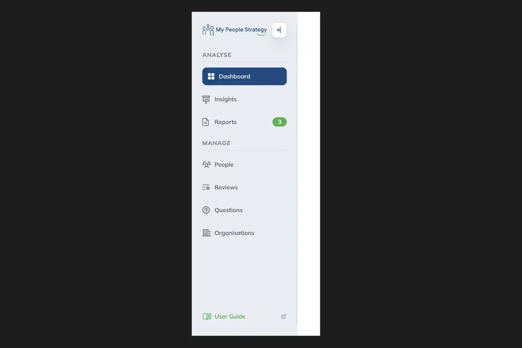
Sidebar Micro-Interaction: A Practical UX Breakdown
Let’s break down the sidebar interaction example step by step to understand how micro-interactions improve usability and perception.
Hover State on the Collapsible Sidebar Icon
When the cursor focuses on the collapsible icon, a hover state appears.
- This indicates that the icon is interactive.
- It reduces hesitation and improves discoverability.
This micro-interaction sets the stage by signalling intent before any action is taken.
Pressed State Feedback on Click
Once the icon is clicked, it transitions into a pressed state.
- This confirms that the system has registered the action.
- It reassures users that the interaction is working as expected.
Immediate feedback like this prevents confusion and unnecessary repeated clicks.
Micro-Interactions on Sidebar Navigation Options
Each sidebar option responds individually as it is interacted with.
- Hover and active states help users scan options quickly.
- Consistent feedback reinforces hierarchy and structure.
These micro-interactions make navigation feel responsive rather than static.
Active State for the Default Sidebar Option
The default or currently selected option maintains a distinct active state.
- This communicates context and location within the product.
- It prevents users from feeling lost within complex workflows.
State persistence is a subtle but critical usability enhancement.
Real-Time Counter Badge Micro-Interaction
One sidebar option includes a counter badge that updates in real time.
- This is a system-triggered micro-interaction.
- It communicates live updates without interrupting the user.
Similar to notification badges in iOS, this pattern balances awareness with non-intrusiveness—an essential trait of good UX.
How Micro-Interactions Improve Perceived Performance
Micro-interactions don’t just improve usability; they also influence how fast and reliable a product feels.
They achieve this by:
- Masking latency through visual feedback.
- Providing immediate confirmation even when processes run in the background.
- Creating a sense of continuity between actions and outcomes.
Users are far more tolerant of delays when the system communicates clearly.
Micro-Interactions vs. Visual Polish
It’s important to distinguish between useful micro-interactions and unnecessary motion.
Effective micro-interactions:
- Serve a clear functional purpose.
- Are subtle and non-distracting.
- Reinforce usability, not aesthetics alone.
When overused or exaggerated, they can quickly become noise rather than value.
Designing Effective Micro-Interactions
When designing micro-interactions for SaaS products, focus on intent rather than animation style.
Good practice includes:
- Designing states intentionally (default, hover, pressed, active).
- Ensuring feedback is immediate and consistent.
- Aligning motion with product tone and brand personality.
The goal is to support users, not impress them.
Conclusion
Micro-interactions are one of the most powerful yet underestimated tools in UX design. Through simple state changes, feedback cues, and real-time indicators, they transform static interfaces into intuitive, trustworthy experiences.
The sidebar example demonstrates how thoughtful micro-interactions improve navigation clarity, reinforce system feedback, and enhance overall product usability. In SaaS products—where efficiency and clarity matter most—these small details make a measurable difference.
Designing great user experiences isn’t about adding more features. It’s about refining the moments users interact with every single day.

